2015 Color Trends
For Nashville, 2015 color trends invite a new way to look at luxury, up cycling, color and craftsmanship. Color can bring the right transformation and energy to warm your space. Using color at home in a decorating scheme can sometimes be a bit of a a challenge. This is why it’s important to select the color that’s just right for your home.You’re bound to see new textures in a neighbor’s home but what kind of colors will you see this year? Latest color design trends reflect the stylish fashion design and consumer trends, bringing innovations, mixing trend analysis, versatility and unexpected solutions into stylish home furnishings and modern interior design. Spring/Summer 2015 color trends aren’t just for the runways. The color authorities at Benjamin Moore and Behr have released their 2015 Color Trend Report, highlighting the key color palettes that they predict will be gracing the walls of homes across the country this year. The 2015 color trends have pulled cues from nature and allow us to admire soft, cool hues blended with subtle warm tones to create a soothing escape from the everyday grind.
Here are a few of our favorites that we felt were worth mention:
This color is from the Berry collection and is AF-650 Caponata. Smoky and rich, these bold tones are the perfect way to incorporate a pop of colour into your home. Grayed-down purples and reds, they pair nicely with taupes and creams, soft shades of gray and even blue-greens for a strong contrast.This rich deep plum is beautiful and bold in an elegant, feminine way. Pair this with taupe and whites. It would also look stunning with golds or silvers.
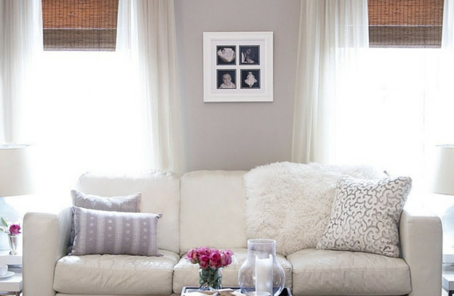
OC-72 Pink Damask is featured here in this relaxed living room space. These amazing grand windows are highlighted with a bold pop of colour to work with the pale pink walls. Muted tones and clean lines, this look is soft and minimalistic. Shades like this are the most muted of the bunch – soft pastels and barely-there off-whites that give just a bit of colour without overpowering a room. Light pinks and taupes add a touch of delicacy.
Much like denim, blues are versatile. Dark or light, they almost work as a neutral, and work well with other blues for a monochromatic look, or with a bold yellow or orange for a great complimentary contrast. Shown here in this bright kitchen, three shades of blues come together in a fun, whimsical way. 2128-40 Oxford Gray on the walls, 2062-60 Blue Hydrengea on the cabinets and 2135-70 Patriotic White on the ceiling pulls the look together.
What’s in a dream? you may have noticed a collaboration of Behr’s deep dream color treatment featuring:
Liaison T15-1
Seared Gray T15-2
Essential Teal T15-3
Your Majesty T15-4
Heritage Oak T15-5
These colors will turn bedrooms into mythical landscapes and are the colors that stimulate your dreams.


